This project was described as an Application Redesign/Upgrade with a quick turn around of 2 weeks. To be responsive while focusing on mobile screen size, increase speed, and designed with a more “Modern” look over the Windows 95 vibe that it currently had. Launch Android, but flexible to iOS later down the road.
The team consisted of 5 developers, 1 UI developer, and myself UX. We had direct contact and availability to user experts and product owners.
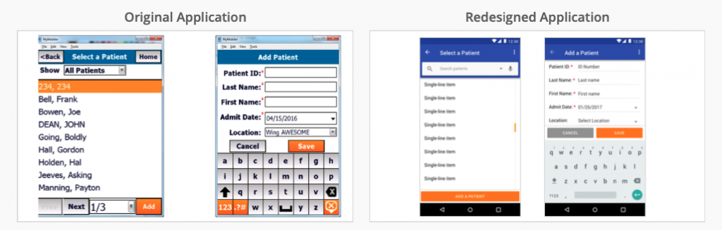
After talking to the client and considering the time I had to work with I leaned on the Material Design theory to help clean up the old looking design(above left) first and foremost (above right). Then I cleaned up processes, while leaning on the expertise of my team, which helped the functionality of the application as well.
Discovery
I met with the team (5 Developers, 1 UI Developer, and myself UX) and the Product Owner to get a grasp of the actual issues with the application and the goals that they had. Also, at this time, I was able to ask any questions and raise any concerns that I had considering this was to be a 2-week project for myself, while development would continue.
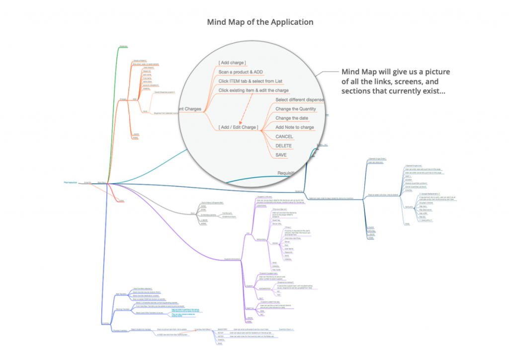
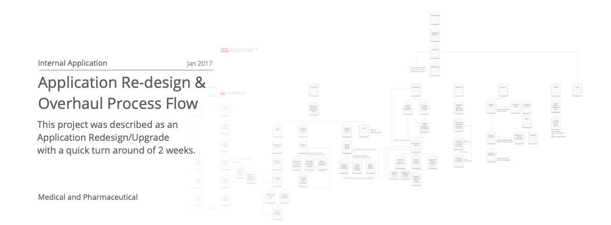
After my conversations, I was given a device…I went through the device in detail and created a Mind-Map of the entire application. This will give us a picture of all the links and screens and sections that currently exist in the application and how they are connected (below).
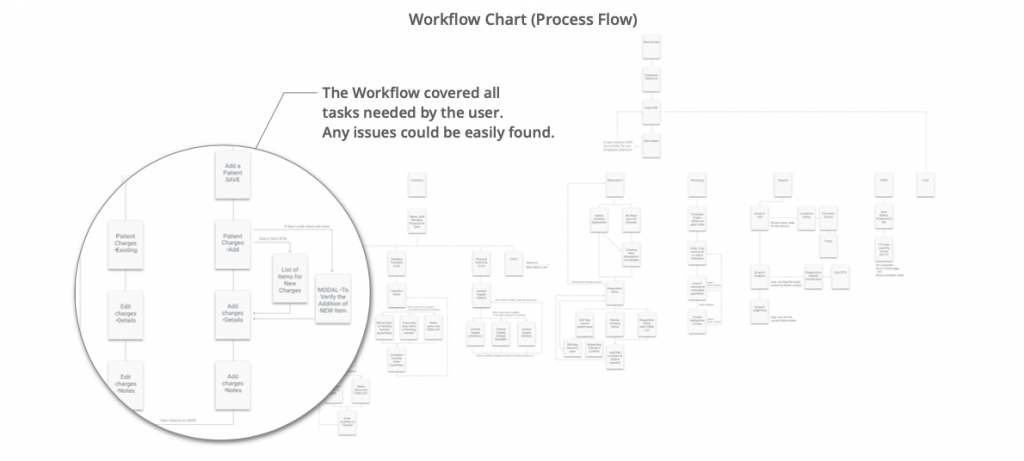
Looking at the Mind Map and talking with the users we found that some processes were not as fluid or intuitive as they should or could be. After talking to users, we created a few Personas and job tasks that that persona would need to perform. I took the tasks and put them across a workflow. This workflow grew into our process flow for the application which could cover all tasks needed (below). (this was a bonus by having a UX person on hand).
Now...What about the design?
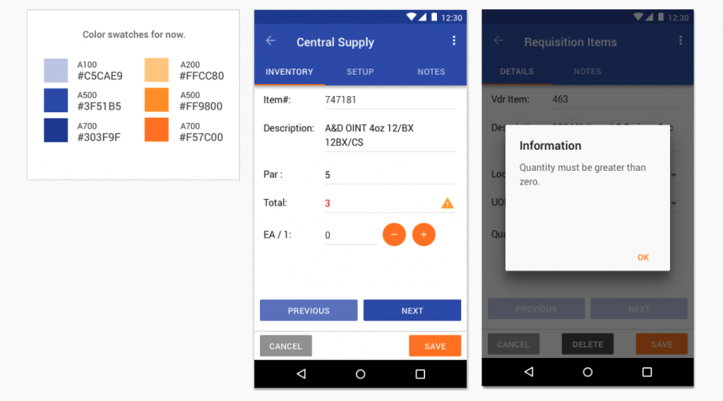
They had a color pallet that wasn’t going to change. I enhanced the colors by using them in more creative ways to give meaning and affordance throughout the application.
As for screens and sections, the first thing I did was give the application more breath by giving a good amount of padding and margins for elements.
The product owner was directing us toward an Android launch with growth into the iOS software later. I cross designed the app so that it could grow smoothly. This gave the app which would be very dense with information a feeling of being easier to read and less tension in the screen. By implementing this design and spreading some of the workflows over an extra screen really cleared up the app. It made the flows more workable and made the App FASTER. (well the technical magic of that was done by the Devs).
The Result
The result was a consistent Design that not only cleared up the information for quicker understanding but gave them a more Modern look and feel, with added enhancements in the performance that was responsive and Mobile focused.
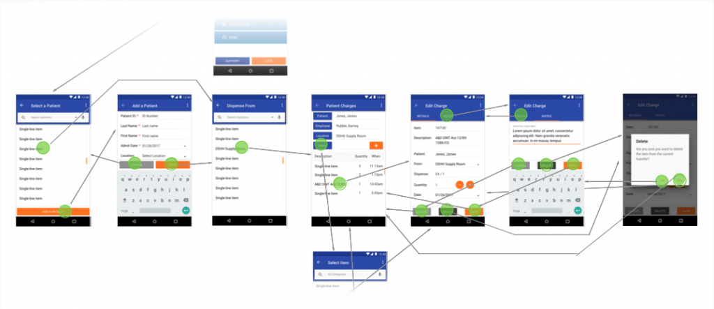
Process Example
Prototypes: Created to assist development with pre-designed screens (example below).